Monday 9 March 2015

Tereza and Tomas


Do you ever feel a total lack of empathy for any of the characters in a novel? That was me with The Unbearable Lightness of Being.

Tereza and Tomas. Spoiler alert:

He cheats. She does nothing really worthwhile.

The end.

And really, who cares about Pope Innocent X when what you're really after is the horror he represents?

Acrylic and pastel, approx. 5'x3'.

Tuesday 10 December 2013

Shakadang & More


Today I'm posting a few pages from my sketchbooks.

Well, are they really sketchbooks? I don't know what to call them. I've created a few books like these over the years. They start off as a mix of sketchbook and travel journal. Soon enough, my drawings are covered over with mementos and my mementos are covered in paint. There's a fair amount of regular old journal in there, too. I don't keep a regular diary. I only have the urge to start one when I feel the need to write a particularly emotional entry. After I've gotten that out of my system I don't really feel the need to record my day to day life, and six months or so I return to the diary to find it woefully empty.

So, books like these have become my diary. It's half art, half writing, and hopefully, fully unified. 

I refuse to use the word scrapbook. Ugh. 


I made these pages after returning from the Shakadang trail in Taroko Gorge in northern Taiwan. It was a treat. 

Back to the sketchbook. Please note that Jesus makes a cameo on the left page.

I became interested in the idea of ghosts that are really just shapeless blobs, and here I'm exploring that idea. Blobs: how scary are they? 

This afterwards became a recurring theme in my work and I'm still not sure if it's a positive development. 


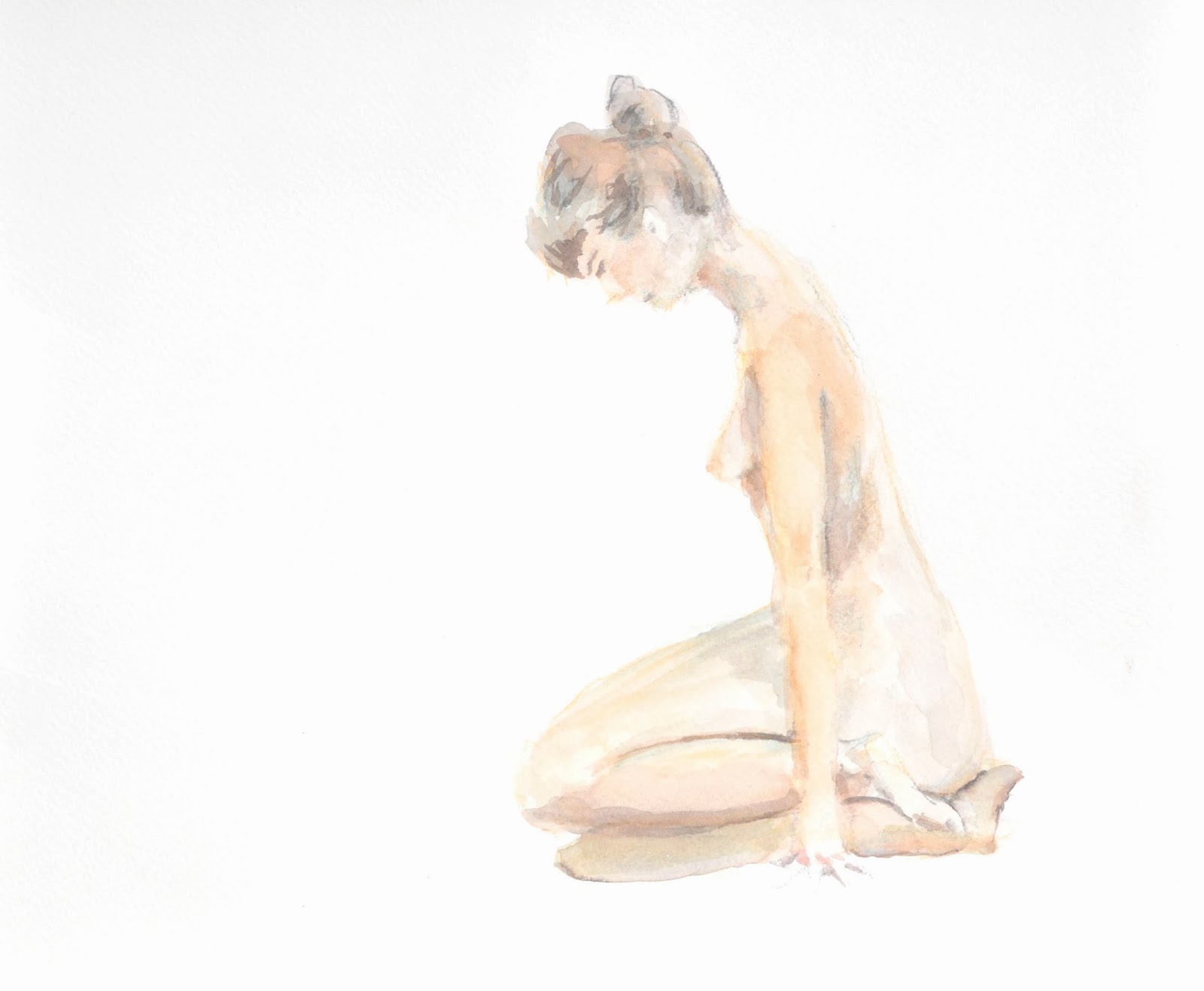
This pages features some ladies done with my (then) brand new water colour pencils. The feathers are paper and they were purchased from one of Taiwan's fantastic stationary stores. They're collaged over top, and let me tell you - they bled like crazy. 

I got the Francis Bacon postcard from a really excellent art show. Whenever I see this I think of the quotation below the picture, from Frankie himself: "I paint in order to be loved."And then I think of my friend Jason's response: "I don't think that really worked out for him."

If you're confused about why that's hilarious, please check out this pants-shittingly amazing and horrific Francis Bacon original here.  


These are some pages where I really went to town with the writing. I was trying to figure out the answer to a quandry I had and still have. What should you pay the most attention to when doing art: whether it looks aesthetically pleasing, or whether it's true to a certain ideal, no matter how conventionally ugly that ideal might be? In other words, is it worth following an aesthetic that might at first elicit a negative response? Does such a thing make sense within the confines of art that isn't conceptual at core; art that's aesthetic in its…morals, I guess you would say. You already know that I'm a big Francis Bacon fan, so that might be your answer right there; Bacon's work is exceedingly pretty, even while it's horrifying to the extreme.

Tyra Banks might call it "ugly-pretty." I've called it "truth or beauty?" which is a slightly more pretentious road to take.

I hope to get more examples from my books up on here. A complete book from front to finish - maybe one where you could even turn the pages - would be my goal.


Wednesday 13 November 2013

White Spaces


More nudes. I've been in the groove with life drawing.


It's really rewarding to see some of my skin tones evolve. Often, white is quite important to my palette. In this one above, for instance, this woman's back is barely coloured. It's skin colour tinted, and in the middle everything becomes quite white.


This woman did not, in fact, have a black eye. This is what happens, though, when you're capturing shadow and the 30 minute session is suddenly over. I'm not at all upset about its being there.


This one was a bit of an experiment. I won't try the charcoal like this again but a thick pen - perhaps in a colour/shade that isn't black - might be nice.


The life drawing furniture is looking good.

For these smaller horizontal photos, click to enlarge them.


 FYI this is a maraca below.


This one above is watercolour pencil.


And this last one is one of my favourites of the past few weeks.

Sunday 20 October 2013

I've been away but now I'm back


It's been so long since I've updated this blog. Life got in the way. While an abandoned blog is a sad, sad thing, having been away means that I have a lot of work that's now ready to see the light of day.

Here are some more nudes, all in watercolour/the occasional bit of pencil (click to enlarge).

We were lucky enough to have a male model - for once - at Life Drawing:


Here are some (various) female models:


And here's a line drawing, just for fun. I was inspired to give up my watercolours by the lovely Clare Brebner, master of clean lines who I sit next to in Life Drawing.


I like how graphic line drawings can be; I don't do more of them because I love capturing shadow and colour. I'm naturally messy.


More paintings to come soon.

Saturday 16 March 2013

Nudes, nudes, nudes


I need a sunny weekend to take photos. I mean, to take better, brighter photos.

Lately I find that I really do like mixing pencil and watercolour. I think that it allows the paint to be less descriptive. As in, it's more impressionistic to have lines that do the job of capturing form, and to have the paint be less attached to the figure. Pencil does double duty in that it's also more expressive - of movement, and of capturing some of the expected shapes i.e. a foot or a hand, a curve, hair, etc. that the viewer looks for. By using pencil for this, it frees paint to be looser. As in, look at this colour and this light as belonging to the figure, but transcending him or her. The pencil is there for design purposes, for drawing, and I think it's nice to have exact, graphic forms. There's this push and pull between wanting to be exact and wanting to be carried away with impressions, and this might be a way to get both without compromise. It seems better to embrace both of these conflicting draws than to try to resolve and pick one or the other, because how could I ever decide?

Monday 18 February 2013

More Studio Work


Here are some rather rough sketches I've made at life drawing in the past few weeks. I've been debating about the use of pencil. Part of me likes using graphite that is visible in the finished product, and half of me likes using watercolour pencil that becomes more or less invisible or mixed in with the finished work. It's easier to sketch before in some medium rather than just start with watercolours right away - you never know when the model is going to shift, move, or be finished the pose all too soon (which is why these are unfinished). I kind of like leaving areas untouched, though, or just giving the smallest indication of what is going on there. It makes for a bit of tension, and draws attention to the nicely detailed areas.

Tuesday 29 January 2013

Big Hair


This is a quick little piece that I did the other night. Watercolours - ahhh, I'm back! I really love working in this medium for nudes. This is also an exploration of a new theme that I might delve into more: BIG HAIR. As my friend Heather says: "The higher the hair, the closer to Jesus."